Destination Travel Guides
I lead the design of a suite of destination pages built at scale which aimed to provide inspiration and information to Expedia's customers for their next trip.
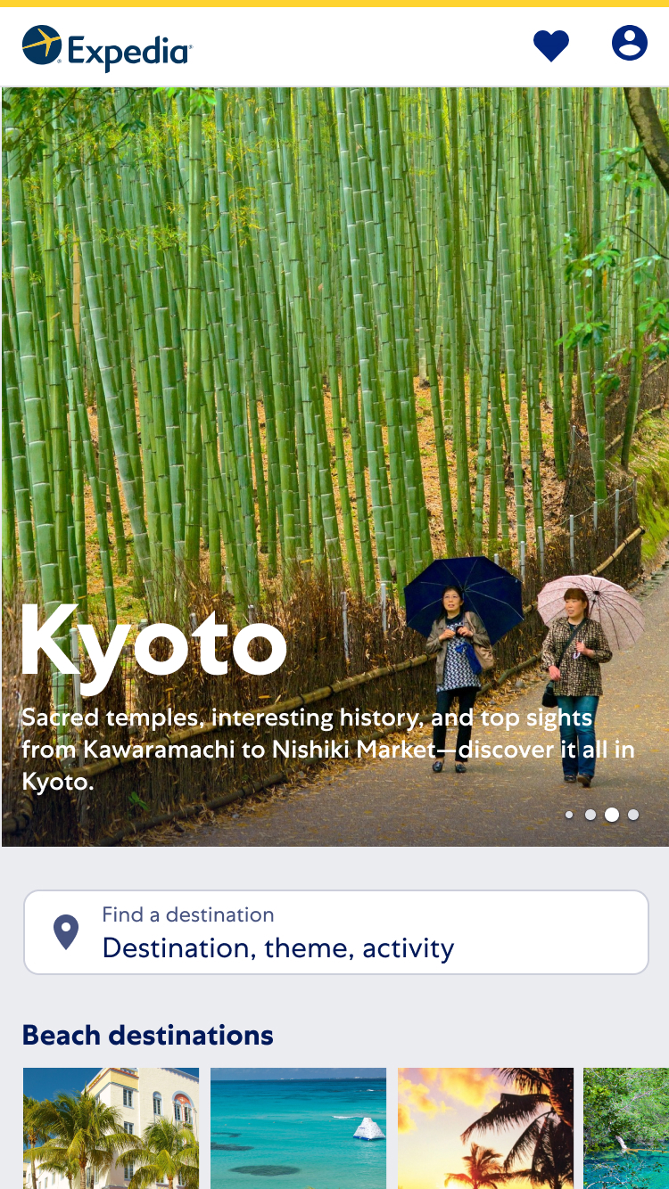
The Destination Travel Guides index page contained a list of popular destinations categorised by an affinity.
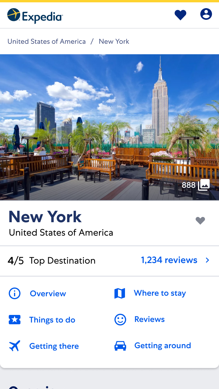
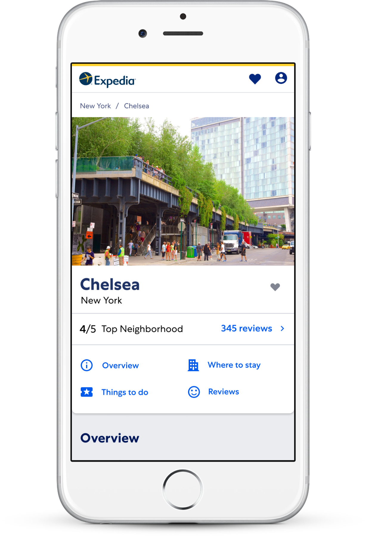
Above the fold content provided user-generated ratings for a destination as well as helpful links to content further down the page.
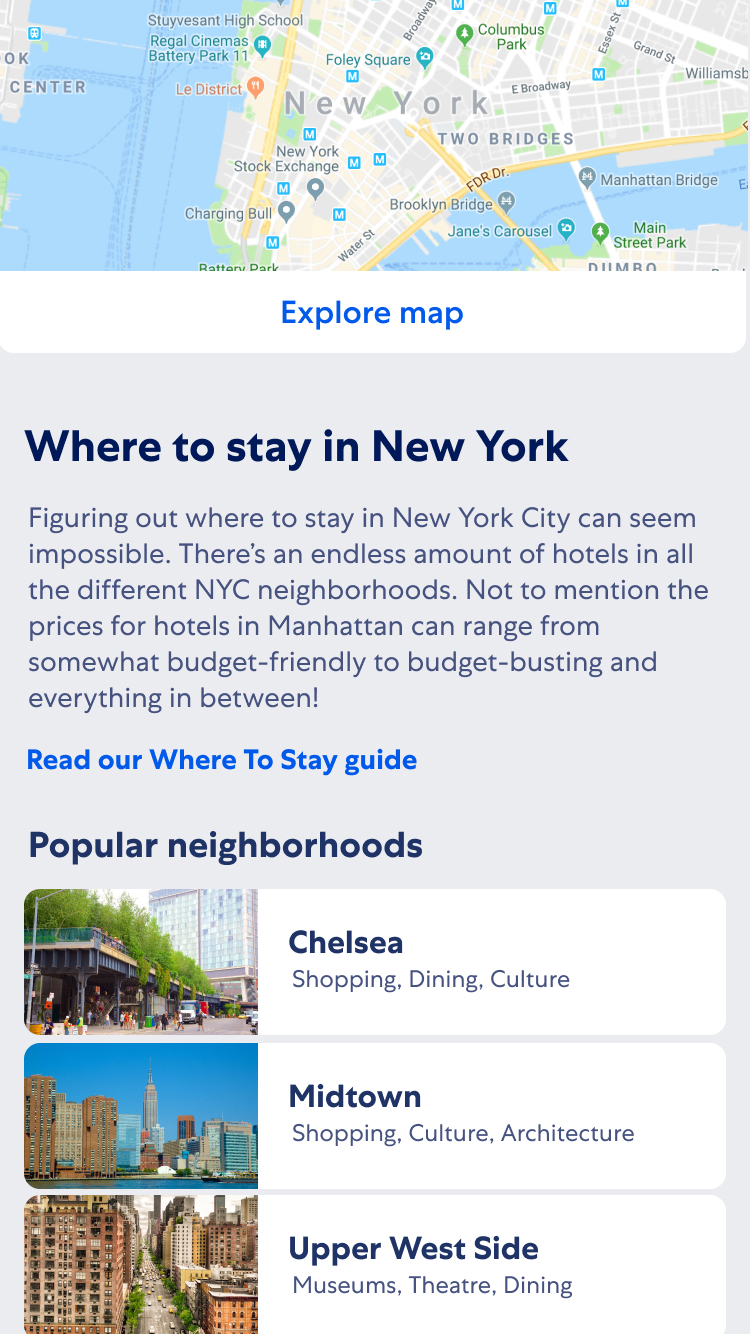
An example of a content module providing a link to a Spoke page. In this case, the Where To Stay module offers a snippet of content with a link to further information.
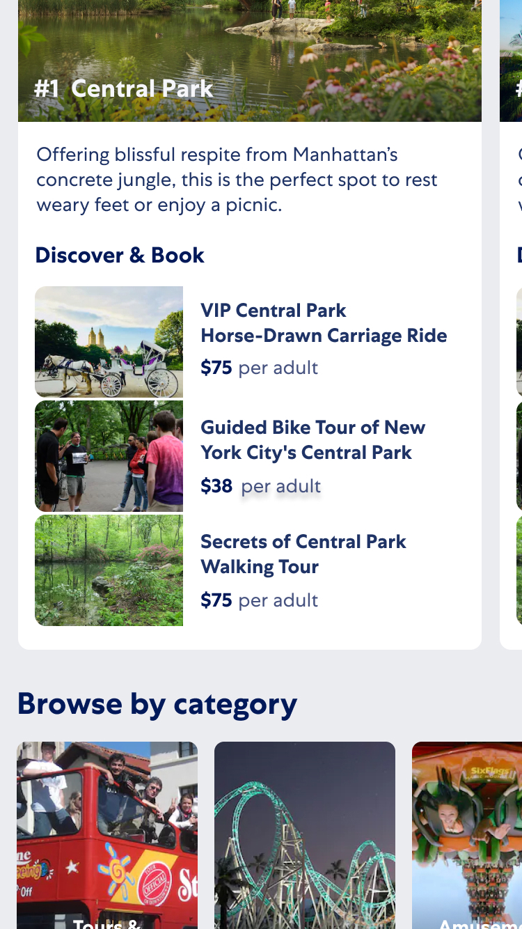
A combination of content provided by third-party content providers about a point of interest (description, images) followed by Expedia products.
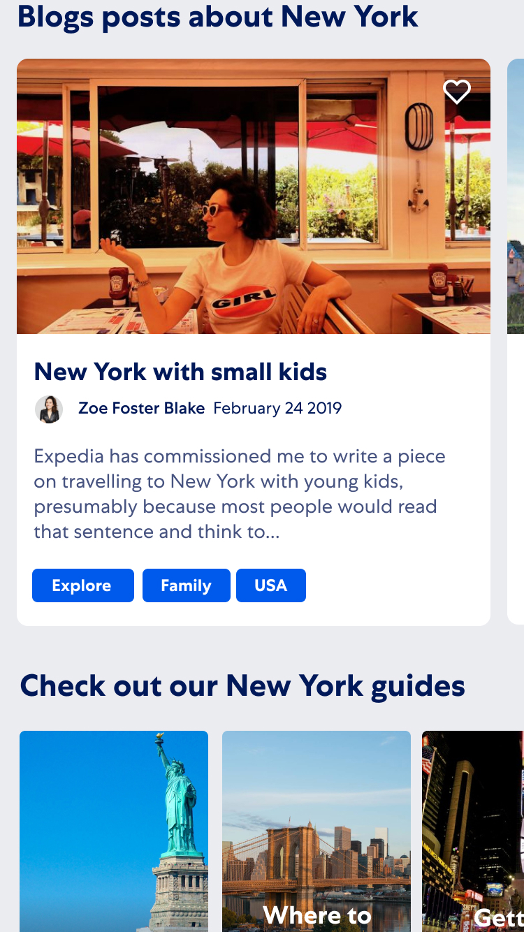
Blog posts kept the content fresh and offered unique insights into destinations.
Applying the Hub and Spoke model with a destination context
The primary source of traffic to the Destination Travel Guides was from Google. An effective SEO technique is to create clusters of pages that are networked through relatable links. This technique is referred to as the Hub and Spoke model.
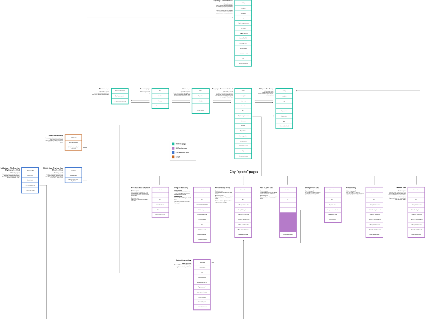
The benefit if using this approach is that if one page performs well in Google then its related pages get a small lift as well. See below a high level map I created that shows the relationship between the pages as well as the content that will be displayed.
When you apply the Hub and Spoke model with a Destination lens, the city pages operate as the hubs and any related affinity or sub-category represent the spokes. These spokes pages are linked from content modules on the hub pages that provide a snippet of content with a link to the another page with deeper content on the topic. For example, a 'Where To Stay' module on the New York page would provide a list of the top three neighborhoods, each with a short description as well as a link at the end linking to the 'Where To Stay in New York' page.
Working with internal and external content providers
The content on the Destination Travel Guides were a mix between destination content including editorial copy, images, videos as well as products that Expedia sold within that destination such as hotels, activities/tours and flights.
The majority of the destination content came from a third party company. My job would be to collaborate internally with product and SEO teams to define the content we wanted on each page and then work with the external providers to source that content.
See below some examples of the kind of content you would see on our Destination Travel Guides.
The power of prototyping with real data
As these pages were built at scale, it was nearly impossible to create a one size fits all design. The content depth for San Fransisco versus Brisbane was glaringly obvious. Take it a step further and compare San Fransisco to a small town in Germany and the difference is night and day.
This become clear very early on when I would create these beautiful static designs in Figma and only see them fall apart once they made their way to production and the content just wasn't there to support them when you started explored less popular destinations.
Thankfully my technical skills meant I was able to address this issue by designing in code through a prototyping app I created. The benefits of this approach became apparent immediately.
-
User testing The app had it's own URL which could be shared with internal stakeholders and more importantly external user testing particpants. I worked with Expedia's user research team to create testing plans that studied partipants experience discovering the content they needed as well as how easily they transitioned into the shopping experience. I would quickly iterate to solve any issues identified.
-
Identify content gaps The application's URL used an ID that represented each destination. This made it super easy to explore different destinations and quickly identify any issues with content. I could then work with the team that provided that content to try and resolve the issues or provide an alternative design to support the unexpected gaps.
-
Cross device design It is one thing to look at a design in mobile viewport in Figma and another to actually hold it in your hand and scroll, tap, swipe.
-
Using the Design System out of the box Expedia has a very mature application ecosystem which meant that I was able to spin up the app that came pre-configured with the UI Toolkit (Expedia's UI library). I could easily compose by designs with these components writing almost zero custom code. Any time I needed to display content in a way that wasn't supported by an existing component I would propose, design and contribute it for the rest of the organisation to use.
Supporting travellers in-trip with contextual content
Destination content is not only helpful to people who are yet to make a decision on their purchase. Providing insights into neighborhoods to explore, attractions to visit, restaurants to eat is just as valuable to travellers who are in trip or have one coming up shortly.
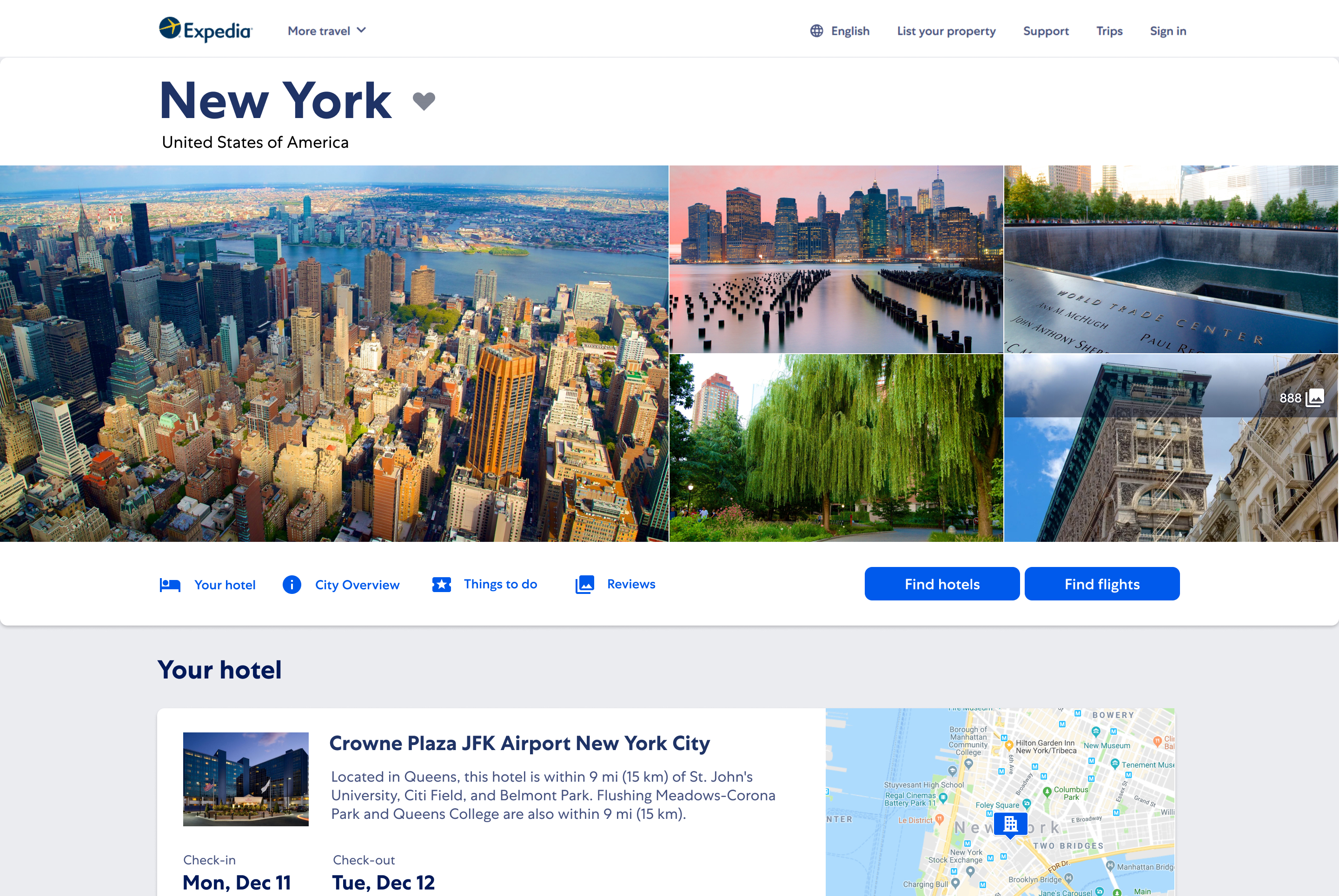
Using the Trip Detail pages within Expedia's iOS and Android apps as well as the desktop version of the Itinerary pages we tested providing links through to our Destination Travel Guides with the travellers hotel and the dates of their travel passed through to provide context.
Native app examples
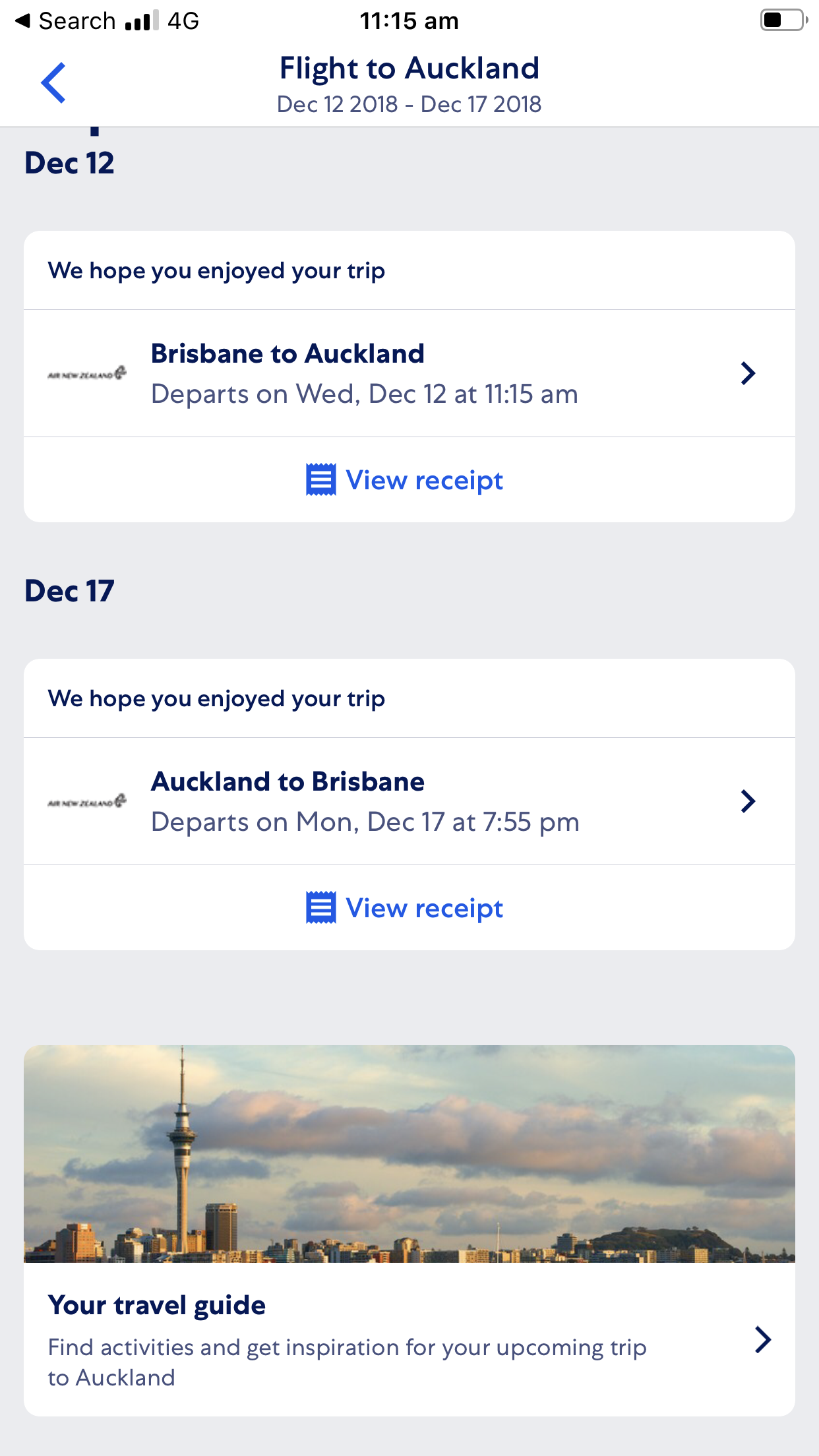
An example of a link to Auckland Destination Travel Guide shown in a users trip details screen within the iOS app.
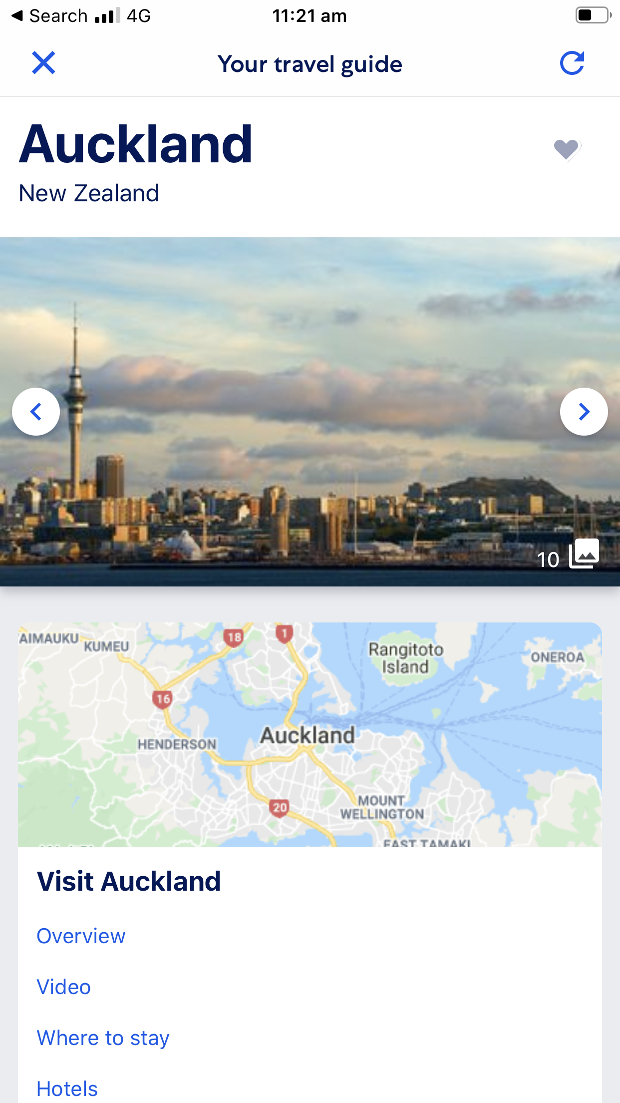
The page is loaded in a WebView. This was done to quickly gather engagement metrics before investing in a native version of the guides.
Outcomes
The Destination Travel Guides continue to evolve today and find ways to support travellers throughout their travel experiences. By March 2018, the pages were getting around 1,000,000 users a MONTH. Here are some more juicy numbers:
- 25% increase on traffic year on year.
- 12% conversion rate. Sounds low but that's above average for low intent traffic.
- 19% of users would add at least one item to their favourite lists. This promoted return visits as well as the opportunity to purchase at a later date.


